Definition
FPO in design stands for “For Position Only.”
It refers to a temporary placeholder used in layouts to show where an image, graphic, or content element will appear in the final design.
If you’ve ever worked with designers, printers, or publishing teams, you may have seen the term FPO written across images, layouts, or design files. At first glance, it can be confusing. Is it a design technique? A printing instruction? Or just a placeholder?
In the world of graphic design, publishing, and printing, abbreviations like FPO help teams communicate quickly during the creative process. Understanding what FPO means can save time, prevent printing mistakes, and help designers manage drafts and layouts efficiently.
Whether you are a graphic designer, content creator, marketer, or student, learning about FPO will help you better understand how professional design workflows operate.
What does FPO mean in design?
Designers use FPO elements to:
- Reserve space for images or graphics
- Maintain layout structure during early drafts
- Prevent accidental printing of unfinished visuals
- Communicate clearly with printers and editors
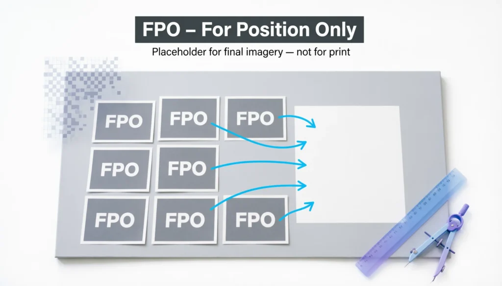
An FPO image is not meant to appear in the final printed or published version. Instead, it simply marks the location where the real content will eventually go.
Origin and History of the Term FPO
Where did the term FPO come from?
The term FPO (For Position Only) originated in the printing and publishing industry, long before digital design software existed.
In traditional print production:
- Designers created layouts manually.
- Real photographs or illustrations might not be ready yet.
- Printers needed to know where those visuals would eventually be placed.
To solve this, designers inserted temporary placeholders labeled “FPO.”
These placeholders indicated:
- The exact position
- The size of the future image
- That the element should not be printed
Evolution in modern digital design
With the rise of digital tools such as:
- Adobe InDesign
- Adobe Photoshop
- Adobe Illustrator
- Canva
- Figma
The concept of FPO remained relevant.
Today, designers often use:
- Low-resolution placeholder images
- Gray boxes labeled FPO
- Watermarked sample images
Even though technology has advanced, the workflow principle remains the same.
What FPO Means in Modern Design Workflows
Why designers use FPO placeholders
FPO elements play an important role in layout planning and design development.
Here are the most common reasons designers use them:
1. Layout structure
Designers can build the overall composition before the final images arrive.
Example:
A magazine layout might reserve space for:
- A cover photo
- Product images
- Editorial graphics
2. Faster design drafts
Instead of waiting for final assets, designers insert placeholders so the project can move forward quickly.
3. File size management
Temporary low-resolution images keep files lighter and easier to edit.
4. Communication with clients
FPO labels signal that the content is not final yet.
This helps prevent confusion during reviews.
5. Preventing printing mistakes
Printers recognize FPO marks and know not to print those images in production files.
Common Places Where FPO Is Used
1. Magazine and newspaper layouts
Editors often place FPO boxes where photographs will appear later.
Example:
“Insert product photo here – FPO”
2. Website mockups
Web designers may use placeholder images before the final visuals are approved.
Example:
A homepage hero section may contain:
- Gray image box
- “FPO Image” text
- Approximate dimensions
3. Advertising layouts
Ad agencies frequently use FPO images while waiting for:
- Professional photography
- Brand assets
- Product shots
4. Book publishing
Publishers insert FPO placeholders for:
- Illustrations
- Chapter images
- Infographics
Example Table: How FPO Is Used in Design Projects
| Design Scenario | Example FPO Usage | Purpose |
|---|---|---|
| Magazine layout | “FPO Image – Model Photo” | Reserve space for photography |
| Website wireframe | Gray image box labeled FPO | Show image placement |
| Product catalog | Temporary product photo | Maintain layout structure |
| Advertising draft | Low-resolution sample image | Speed up design process |
| Book design | Illustration placeholder | Indicate future artwork |
This approach ensures design structure remains intact even before final assets arrive.
Real-World Examples of FPO in Context
Example 1: Magazine design
A magazine designer creates a layout but the photoshoot hasn’t happened yet.
The layout might show:
“FPO – Fashion Model Image”
This tells editors that a real photo will replace it later.
Tone: Neutral and professional.
Example 2: Website prototype
A UI designer builds a website mockup using placeholder images.
Example label:
“Hero Image – FPO”
Meaning:
The hero image position is fixed, but the final image isn’t ready yet.
Tone: Neutral.
Example 3: Advertising concept
An ad draft may include a stock photo marked:
“FPO – Replace with final product shot”
Tone: Instructional.
Example 4: Client presentation
Sometimes FPO images are used in presentations to show visual ideas without committing to final imagery.
Example:
“Background image (FPO) – Final version coming after branding approval.”
Tone: Friendly and explanatory.
How to Identify an FPO Image
Designers often mark placeholders clearly so they are not confused with final content.
Common FPO indicators include:
- The word “FPO” printed over the image
- Watermarked images
- Gray boxes with text
- Low-resolution images
- Placeholder icons
Example placeholder label:
“Image FPO – Do Not Print”
This prevents accidental use in production.
FPO vs Other Design Terms
Many beginners confuse FPO with similar design terms. Understanding the differences helps avoid mistakes.
Comparison Table
| Term | Meaning | When Used |
|---|---|---|
| FPO | For Position Only placeholder | Layout planning |
| Placeholder | Temporary element | Design drafts |
| Wireframe | Basic layout structure | UI/UX design |
| Mockup | Visual representation of final design | Client presentations |
| Prototype | Interactive design model | User testing |
Key difference
- FPO focuses on position only
- Other terms focus on structure or functionality
FPO in Different Design Software
Adobe InDesign
InDesign frequently uses FPO images for editorial layouts.
Designers import low-resolution images while linking the high-resolution files later.
Adobe Photoshop
Photoshop designers may create:
- Image frames
- Sample images
- FPO labels for layout previews
Canva
In Canva designs, placeholders can act like FPO elements until final assets are uploaded.
Figma
UI designers use:
- Placeholder components
- Sample images
These serve the same purpose as FPO.
Tips for Using FPO Correctly in Design Projects
1. Always label placeholders clearly
Write:
- FPO
- Replace image
- Placeholder
This prevents confusion.
2. Remove all FPO elements before final delivery
One of the most common mistakes is forgetting to replace them before publishing or printing.
3. Use realistic dimensions
Even if an image is temporary, the size should match the final image space.
4. Communicate with your team
Ensure:
- Editors
- Printers
- Clients
all understand which elements are temporary.
5. Use low-resolution images
This keeps the file lightweight while maintaining layout accuracy.
Alternate Meanings of FPO
Although FPO usually means “For Position Only” in design, the abbreviation can have other meanings in different industries.
| Industry | Meaning |
|---|---|
| Design & Printing | For Position Only |
| Military | Fleet Post Office |
| Finance | Follow Public Offering |
| Logistics | Free Port Order |
However, when used in graphic design or publishing, it almost always refers to For Position Only placeholders.
Professional Alternatives to FPO
Sometimes designers use other terms instead of FPO, especially when communicating with non-design clients.
Common alternatives include:
- Placeholder image
- Temporary image
- Draft visual
- Sample graphic
- Layout image
Example:
Instead of saying:
“This is an FPO image.”
You could say:
“This is a placeholder image that will be replaced later.”
This makes communication clearer for clients or beginners.
FAQs:
1. What does FPO stand for in design?
FPO stands for “For Position Only.” It refers to a placeholder used in design layouts to show where images or elements will appear.
2. Why do designers use FPO images?
Designers use FPO images to reserve space, maintain layout structure, and continue working before final visuals are ready.
3. Are FPO images printed in the final design?
No. FPO images are temporary placeholders and should be replaced before final printing or publishing.
4. What does an FPO image look like?
An FPO image usually includes:
- The label FPO
- A gray placeholder box
- A watermarked sample image
- Low-resolution graphics
5. Is FPO still used in digital design?
Yes. Even with modern tools like InDesign, Photoshop, Figma, and Canva, designers still use FPO placeholders during the design process.
6. What is the difference between FPO and a placeholder?
They are very similar, but FPO specifically means the element is only there to mark position, especially in printing and layout design.
7. What happens if an FPO image is not replaced?
If an FPO image is accidentally left in the final file, the wrong image or placeholder may be printed or published, which can look unprofessional.
8. Is FPO used in web design?
Yes. Web designers sometimes use placeholder images or text labeled FPO when creating wireframes or early prototypes.
Conclusion
Understanding what FPO means in design is essential for anyone working with layouts, publishing, or graphic design workflows.
In simple terms, FPO stands for “For Position Only.” It marks a temporary placeholder used to reserve space for images or elements that will be added later.
Although it began in the traditional printing industry, the concept of FPO remains relevant in modern digital design tools and workflows.
If you work with design files or collaborate with creative teams, recognizing FPO placeholders will help you avoid confusion and maintain a smooth design process.
Discover More Related Articles:
- Understanding FIP in Baseball: Definition, Formula, and Uses (2026)
- TW in Jewelry Meaning: What It Really Stands For (2026)

Amanda Lewis is a professional content writer and word-meaning researcher who specializes in explaining definitions, slang, abbreviations, and modern language terms. She writes for WordNexy.com, where she creates clear, accurate, and reader-friendly articles to help users understand word meanings and proper usage. Her work is especially useful for students, writers, and online readers seeking quick and reliable explanations.